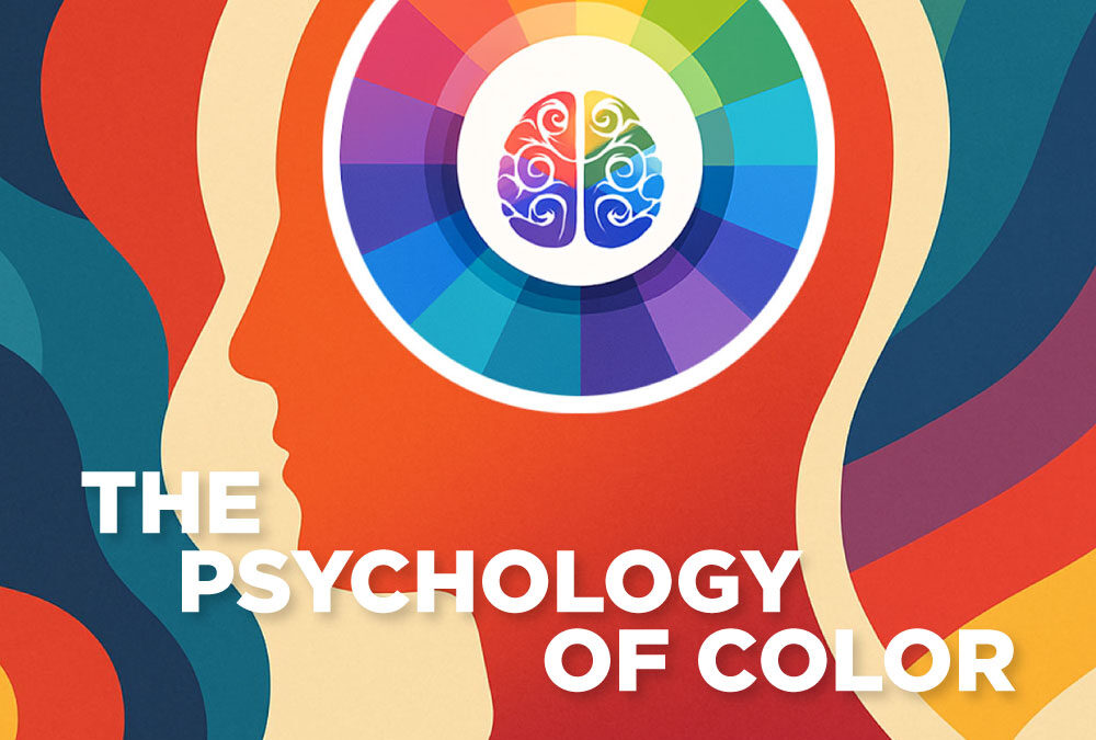
Have you ever noticed how a fast-food logo often uses red and yellow, while a bank’s branding is almost always blue? That’s no accident. It’s the psychology of color at work—a powerful tool in graphic and web design that shapes how people feel, behave, and connect with your brand.
Whether you’re creating a logo, website, or marketing campaign, choosing the right colors can mean the difference between a forgettable brand and one that sticks in people’s hearts (and minds).
Here’s how to use color psychology to design with emotional impact.
Why Color Matters in Design
- First Impressions: Research shows people form opinions about products within 90 seconds—and up to 90% of that is based on color alone.
- Emotional Connection: Colors evoke feelings. They can calm, energize, inspire trust, or spark excitement.
- Brand Recognition: Consistent color use increases brand recognition by up to 80%.
👉 In short: your colors aren’t just decoration—they’re strategy.
The Psychology of Common Colors
Here’s what the most-used brand colors communicate:
- Red: Energy, passion, urgency, excitement (Think Coca-Cola, Netflix)
- Orange: Creativity, friendliness, enthusiasm (Think Fanta, SoundCloud)
- Yellow: Optimism, warmth, clarity, cheerfulness (Think McDonald’s, IKEA)
- Green: Growth, nature, balance, sustainability (Think Whole Foods, Spotify)
- Blue: Trust, stability, professionalism, calm (Think PayPal, Facebook… and, California Dingo Media! )
- Purple: Luxury, creativity, wisdom, imagination (Think Hallmark, Cadbury)
- Black/Gray: Sophistication, authority, elegance, neutrality (Think Apple, Nike)
- White: Purity, simplicity, minimalism, clarity (Think Apple, Adidas)
How to Choose the Right Colors for Your Brand
Know Your Audience
- What emotions do you want them to feel?
- What colors resonate culturally with your target market?
Define Your Brand Personality
- Is your brand bold and energetic? (Red/orange tones)
- Trustworthy and professional? (Blue/gray tones)
- Creative and playful? (Purple/yellow tones)
Limit Your Palette
- Stick with 2–3 primary brand colors and 1–2 accent colors. Too many creates confusion.
Consider Contrast and Accessibility
- Ensure text is readable against backgrounds. Good contrast improves accessibility and user experience.
Test Across Platforms
- Your colors should look consistent on web, print, and mobile. Always test before finalizing.
Color Combos That Work
- High Contrast: Black + Yellow (striking, attention-grabbing).
- Analogous: Blue + Teal + Green (calming, harmonious).
- Complementary: Purple + Yellow (balanced but bold).
- Minimalist: Black + White + One Accent Color (clean, modern).
Mistakes to Avoid
- Using too many colors (dilutes your identity).
- Relying solely on color to communicate meaning (not accessible for color-blind users).
- Choosing colors based on personal preference rather than strategy.
Your Turn:
What’s your brand’s primary color, and how do you think it makes your audience feel?
Final Thoughts
The psychology of color is about more than making things look pretty—it’s about designing with intention. When you align your brand colors with your message and audience, you create an identity that doesn’t just get noticed—it connects emotionally.
Because at the end of the day, people don’t just buy products or services—they buy how those products make them feel.
Ready to choose colors that emotionally connect with your audience? Let’s build a brand identity that stands out and resonates.
Contact California Dingo Media Today!
Thanks for reading!
David
(Cali Dingo)

